HNGR

Key Concept
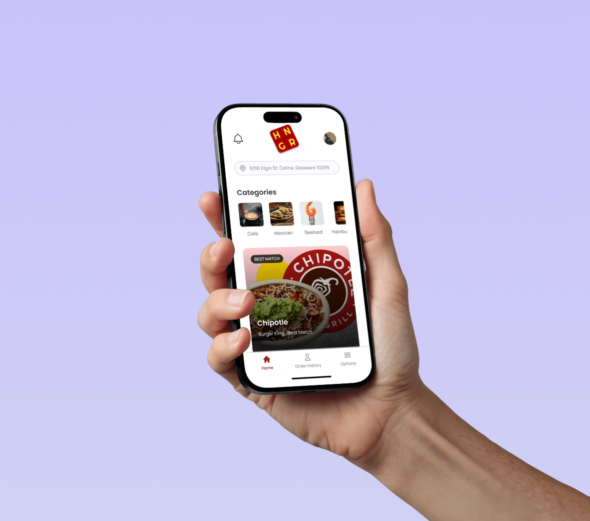
Food delivery often hides fees until checkout, causing frustration and overpayment. HNGR tackles this by putting all fees front and center so users can compare and choose confidently.
During my summer with the CodeHouse Scholars Initiative, I teamed up with two other interns to design HNGR, a week-long UX project tackling price transparency in food delivery. Our goal was to create an app that compares total costs across platforms like Uber Eats and DoorDash, helping users avoid hidden fees and order with confidence. The biggest challenge was gathering insights and translating them into a polished design in just one week, requiring quick decision-making and focused collaboration.
July 2021
UX Designer
Mobile App
CodeHouse
Goal
Intro to Admit AI
Design an intuitive, transparent tool that shows all delivery costs up front, including service, distance, and platform fees, so users can quickly compare and choose the best option.
HNGR is a mobile app that lays out total delivery costs—from delivery, service, and distance fees—in one clear view. Users get instant comparisons across multiple platforms, helping them make smart, budget-friendly choices.
Research
Insights
“No one really told me when or how to apply. I had to figure it out on my own.”
- 11th grade student

I. Student Clarity
Lack of structure, visual progress, and timely reminders.

II. AI Guidance
Students & admins want smarter, AI-driven support.

III. Admin Visibility
Need clear dashboards and bulk tools to scale support.
These questions helped me look beyond just surface-level issues and dig into the deeper “why” behind user frustrations.
We surveyed 50+ students and interviewed 20 admins, focusing on low-income and first-gen communities and tested early concepts and prototypes with both groups.
“I’m tracking 150+ students with a spreadsheet, which isn’t sustainable.”
- Charter school counselor

Research goals
Process
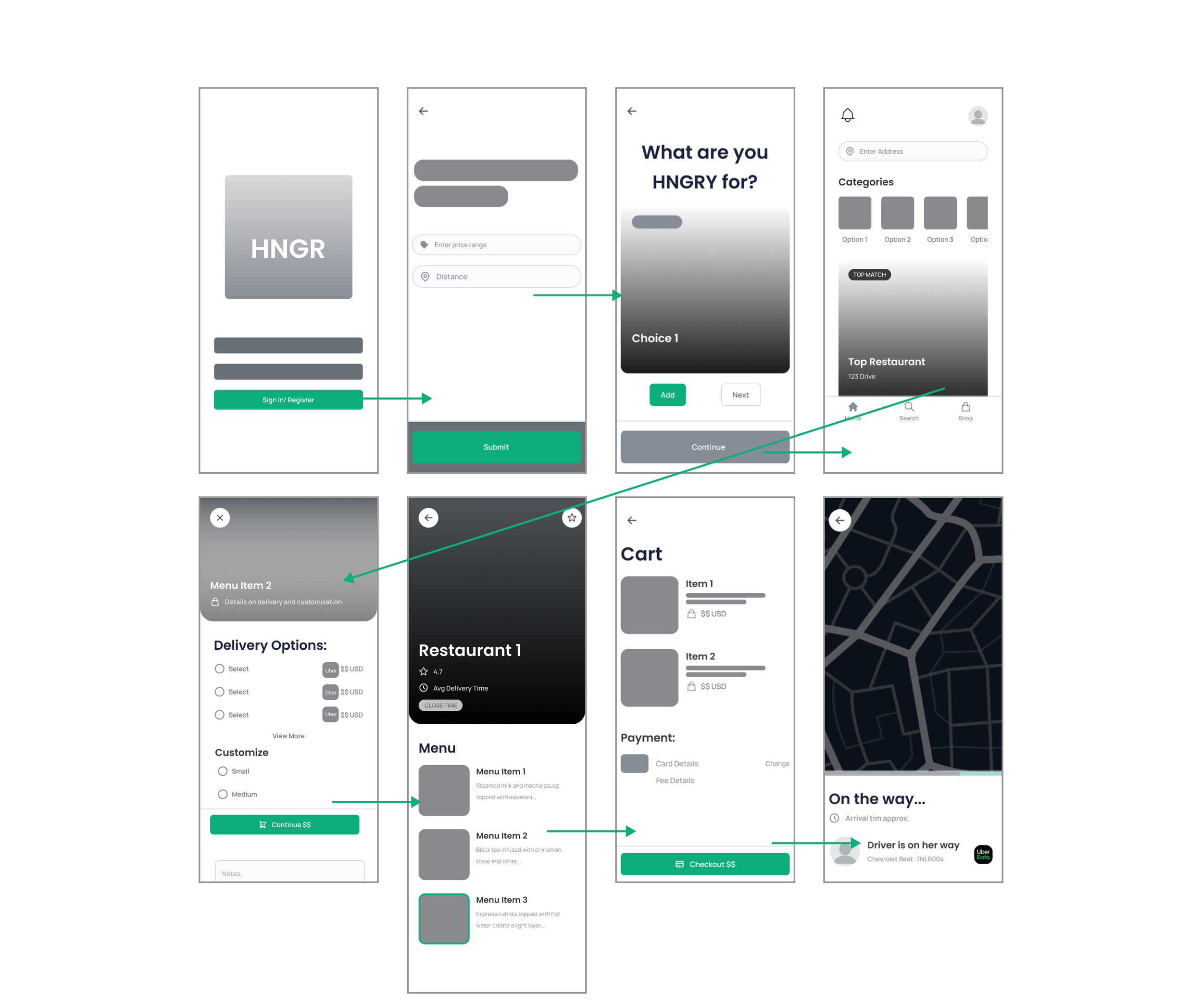
1. User Flow & Wireframes
Designed a path from browsing to checkout, testing both list and map-style layouts for quick comparison clarity.

2. Usability Testing
Round 1 (5 participants):
• 80% found the interface intuitive;
• 60% wanted quicker comparisons;
• Fee breakdowns were unclear.
Profile applications list wireframes
Round 2:
Fee clarity improved across the board;
Business owners appreciated tracking and pricing control.
Old designs for student goal tracking
Final UI Highlights
Outcome & Reflection
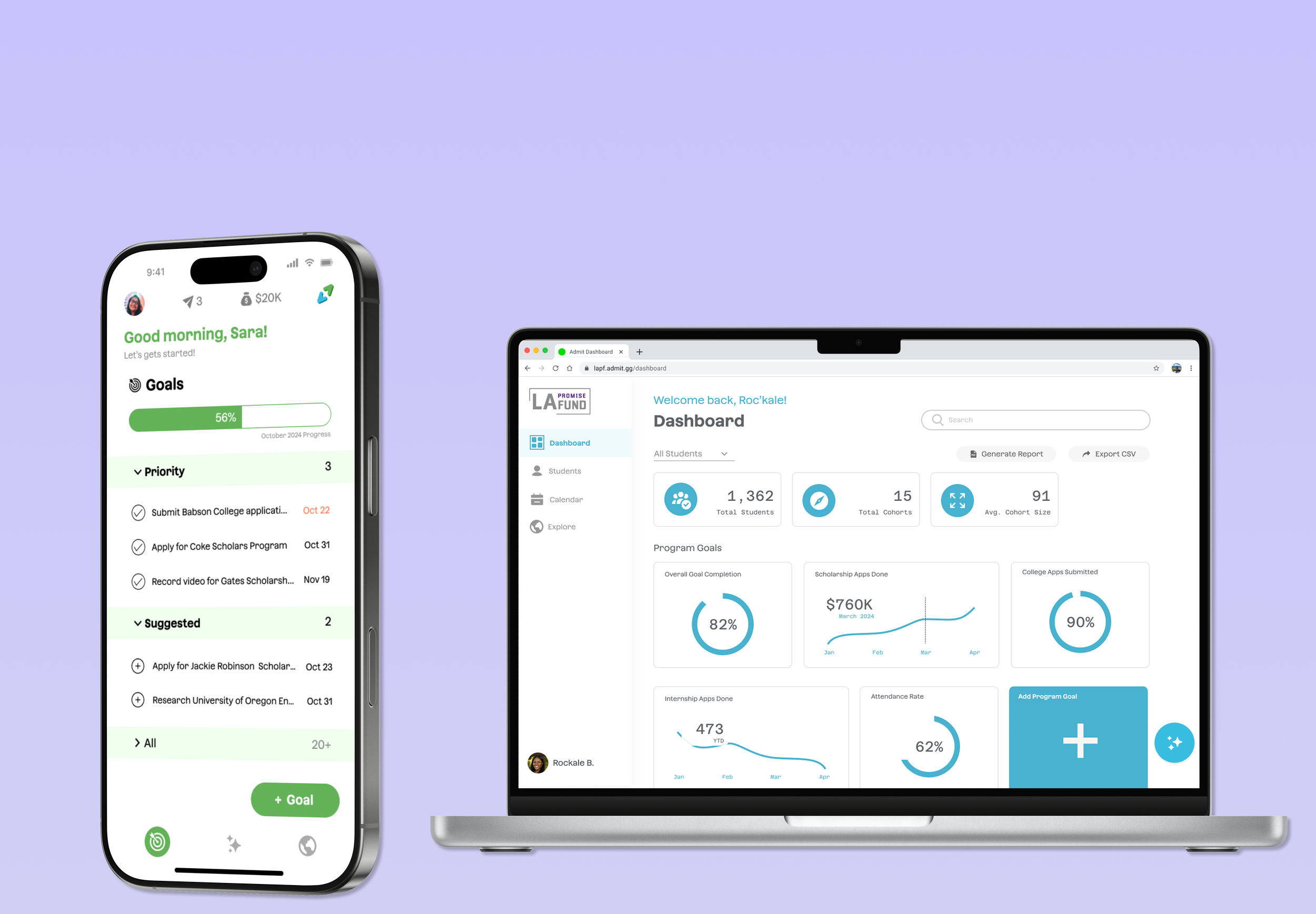
After the end of my contract, Admit officially launched in August 2024 and has since secured its first partner organization. The platform saw an increase in both student and admin engagement among early partners. Backed by its first partner, Camelback Ventures, Nile Studio continues to grow and scale Admit to a broader audience in 2025.
1. Add more delivery platforms for wider comparisons.
2. Add scalable filters like “Max Fee Threshold” and “Fastest Delivery Only.”
Potential Next Steps
Impact
Reflection


