
🛠️ Project In Progress
This project is currently being updated to match the style and quality of my other case studies. You’re welcome to explore it, but please note it’s not yet fully refined. Thanks for your patience!
HNGR Design Project
Project Duration
July 2021
Role
CodeHouse Intern
Team
Collaborated on an intern pod of 3
The Problem
In today’s mobile food delivery market, users face frustrating experiences with inconsistent pricing, hidden fees, and a lack of transparency across delivery platforms. These problems leave customers paying significantly more than necessary.
The Goal
The goal was to design an intuitive, user-friendly app that provides complete price transparency across multiple food delivery platforms, allowing users to save money and make informed decisions.
My Role
Position: UX Designer
Responsibilities
Competitive Research & Analysis
Wireframing & Prototyping
Usability Testing
UI Design
User Research
Since our goal was to tackle pricing transparency in the food delivery industry, we started with a competitive analysis of leading platforms such as Uber Eats, DoorDash, and Postmates.
Competitive Analysis Insights
Hidden Fees: Major platforms include hidden fees like “service charges” or inflated delivery costs that users don’t see until checkout.
Inconsistent Pricing: The same item from the same restaurant can have different prices across delivery platforms.
User Frustration: Online reviews and forums frequently mentioned frustration over lack of transparency with final costs.
Competitor Analysis Quotes
“The markups on food deliveries were 7 percent to 91 percent more than what you would pay if you bought the meal directly from the restaurant.”
“News outlets are reporting that POS provider Toast is even emulating those extra charges by adding their own added fees for online ordering and takeout delivery services, forcing guests to pay more.”
Personas
Created from Competitive Research
Andrew
Demographic
Restaurant Owner, running a small local restaurant.
Pain Points
Chris struggles with how the delivery services mark up his prices, making customers unhappy and affecting his reputation.

Sarah
Demographic
College Student, age 20-25, ordering food multiple times a week.
Pain Points
Sarah is frustrated by the surprise costs at checkout, making it hard to stick to a budget when ordering food.

How Might We
Building on our research insights, we established a clear guideline to steer us into the next phase of our design process. To focus our efforts and set a concrete direction, we formulated a critical “How Might We” question:
How might we assist users in making informed food ordering decisions by providing them with transparent pricing information, thereby removing the frustration of hidden fees and helping them stay within their budget?
Brainstorming
We conducted brainstorming sessions based on our competitive analysis and insights to generate creative solutions that address the challenges users face with hidden fees and inconsistent pricing.
Brainstorming Ideas:
Price Comparison Feature: This allows users to easily compare total costs (including fees) across delivery platforms.
Fee Breakdown at Checkout: Ensure users can see a full breakdown of delivery, service, and distance fees before they place their order.
Filters for Delivery Options: Provide filters based on delivery times, distance, and fees to help users make the best choice for their needs.
Ideation
Flow Charts & Concept Sketches


The initial concept sketches explored the flow of both users and employers interacting with the app. We focused on:
• Ease of Use: Simplifying how users apply for jobs or order food.
• Map-Based UI: Allowing users to see nearby restaurants or jobs on a map, offering quick comparisons.
• Streamlined Interface: Employers can post food orders or gigs and manage applicants/delivery workers easily.
Wireframing
Once the sketches were finalized, we created low-fidelity wireframes and conducted quick prototype tests with users to gather feedback and iterate on the design.

Usability Studies

We conducted a condensed usability study with a small group of users due to the limited project timeline.
First-Round Findings:
Participant Count: 5 users (3 customers, 2 restaurant owners), conducted over three days.
Feedback from Customers:
80% of users liked the clean interface but 60% wanted quicker access to compare prices across different platforms.
1 out of 3 customers mentioned difficulty understanding the breakdown of fees during checkout.
Feedback from Restaurant Owners:
Both restaurant owners appreciated the app’s order tracking system, but one mentioned that more detailed control over pricing would help manage discrepancies.
Second-Round Findings:
Participant Count: 5 users (same group from the first round), conducted two days after first-round improvements.
Customer Feedback:
After updates to the fee breakdown feature, all 3 customers found the information more transparent and appreciated the clearer breakdown of fees.
2 out of 3 customers found the comparison feature more accessible and noted quicker checkout times.
Restaurant Owner Feedback:
1 restaurant owner felt satisfied with the pricing control improvements, while the other was indifferent but appreciated the enhanced order tracking system.
Mockups & HiFi Prototypes
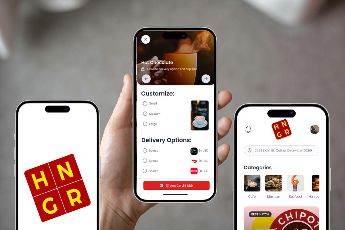
The Product


HNGR is a mobile app designed to compare prices across food delivery platforms. The app empowers users by showing all the available delivery services, and providing a transparent view of costs, including hidden fees, so users can make informed decisions about where to order from.
Key Features:
Price Comparison: Users can easily compare total prices, including all hidden fees, across different food delivery platforms.
Fee Breakdown: At checkout, all delivery fees, service fees, and distance charges are broken down clearly.
-
![]()
Fee Transparency at Checkout
Users can now see a clear breakdown of all costs, including delivery, distance, and restaurant charges, before placing an order. This ensures complete transparency and prevents surprise charges at checkout.
-
![]()
Mobile Ordering Homepage
Seamlessly browse food options from multiple categories. The homepage presents users with tailored suggestions based on their preferences and location, making it easy to compare options across various food delivery services.
-
![]()
Price Gouging
Users can easily filter search results by price range and delivery distance to find the most cost-effective options. The app dynamically adjusts results based on budget preferences, allowing users to make the best dining decisions.
-
![]()
Delivery Choice Selection
Users have the freedom to choose their preferred delivery service based on price and delivery time. By comparing multiple services at once, users can make informed decisions about how they want their food delivered.


Outcome & Future Steps
Outcome
The HNGR prototype successfully addressed user pain points related to food delivery transparency:
• Reduced Hidden Fees: Users were able to avoid hidden fees by comparing platforms.
• Increased Control: Users had full transparency on costs, enabling them to stick to a budget.
Future Development
Expand Platform Integration: Add more delivery platforms for price comparison
Custom Filters: Allow users to set more custom filters based on delivery time, fees, and distance.
Key Takeaways
Impact
By focusing on price transparency, HNGR offered a much-needed solution in a market where hidden fees were the norm. The app empowered users to make more informed decisions.
What I Learned
This project helped me understand the power of competitive analysis in identifying gaps in the market and highlighted the importance of designing around real user pain points.
Other Projects
GNG

Admit